Plotting- Simple plots,setting limits,subplot, semilog, loglog plots
data—plotting—is one of the most important tools for evaluating and understanding scientific data and theoretical predictions. Plotting is not a part of core Python, however,but is provided through one of several possible library modules. The most highly developed and widely used plotting package for Python is matplotlib (http://matplotlib.sourceforge.net/). It is a powerful and flexible program that has become the defacto standard for 2D plotting with Python.
Because matplotlib is an external library—in fact it’s a collection of libraries—it must be imported into any routine that uses it. matplotlib makes extensive use of NumPy so the two should be imported together. Therefore, for any program that is to produce 2D plots, you should include the lines
import numpy as np
import matplotlib.pyplot as plt
plot function.
It is used to plot x-y data sets and is written like this
plot(x, y)
where x and y are arrays (or lists) that have the same size. If the x array is omitted, that is, if there is only a single array, the plot function uses 0, 1, ..., N-1 for the x array, where N is the size of the y array. Thus, the plot function provides a quick graphical way of examining a data set
Simple Line plot
import matplotlib.pyplot as plt
import numpy as np
plt.plot([1,2,3,2,3,4,3,4,5])
plt.show()

Plot the function y = 3x^2 for −1 ≤ x ≤ 3 as a continuous line. Include enough points so that the curve you plot appears smooth. Label the axes x and y ( university question)
import matplotlib.pyplot as plt
import numpy as np
x=np.linspace(-1,3,100)
y=3*x**2
plt.plot(x,y)
plt.xlabel("x")
plt.ylabel("3x^2")
plt.show()

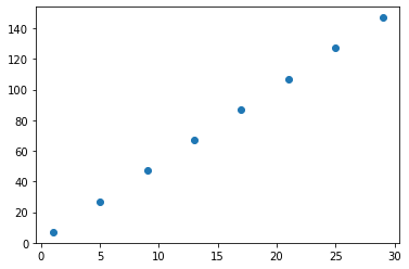
Write a program to plot a range from 1 to 30 with step value 4. Use following algebraic expression to show data y = 5*x+2. ( university question)
import matplotlib.pyplot as plt
import numpy as np
x=np.array(range(1,30,4))
y=5*x+2
plt.scatter(x,y)
plt.show()
sine function over the interval from 0 to 4pi
import numpy as np
import matplotlib.pyplot as plt
x = np.linspace(0, 4.*np.pi,100)
y = np.sin(x)
plt.plot(x, y)
plt.show()
note: the linspace function will create 100 data points from 0 to 4pi

figure() creates a blank figure window. If it has no arguments, it creates a window that is 8 inches wide and 6 inches high by default, although the size that appears on your computer depends on yourscreen’s resolution. For most computers, it will be much smaller.You can create a window whose size differs from the default using the optional keyword argument figsize, as we have done here. If you use figsize, set it equal to a 2-element tuple where the elements, expressed in inches, are the width and height, respectively, of the plot. Multiple calls to figure() opens multiple windows:
figure(1) opens up one window for plotting, figure(2) another, and figure(3) yet another.
plot(x, y, optional arguments) graphs the x-y data in the arrays x and y. The third argument is a format string that specifies the color and the type of line or symbol that is used to plot the data. The string 'bo' specifies a blue (b) circle (o). The string 'g-' specifies a green (g) solid line (-). The keyword argument label is set equal to a string that labels the data if the legend function is called subsequently.
xlabel(string) takes a string argument that specifies the label for the graph’s x-axis.
ylabel(string) takes a string argument that specifies the label for the graph’s y-axis.
legend() makes a legend for the data plotted. Each x-y data set is labeled using the string that was supplied by the label keyword in the plot function that graphed the data set. The loc keyword argument specifies the location of the legend. The title keyword can be used to give the legend a title.
axhline()
draws a horizontal line across the width of the plot at y=0. Writing axhline(y=a) draws a horizontal line at y=a, where y=a can be any numerical value. The optional keyword argument color is a string that specifies the color of the line. The default color is black.The optional keyword argument zorder is an integer that specifies which plotting elements are in front of or behind others. By default, new plotting elements appear on top of previously plotted elements and have a value of zorder=0. By specifying zorder=-1, the horizontal line is plotted behind all existing plot elements that have not be assigned an explicit zorder less than -1. The keyword zorder can also be used as an argument for the plot function to specify the order of lines and symbols. Normally, for example, symbols are placed on top of lines that pass through them.
draws a horizontal line across the width of the plot at y=0. Writing axhline(y=a) draws a horizontal line at y=a, where y=a can be any numerical value. The optional keyword argument color is a string that specifies the color of the line. The default color is black.The optional keyword argument zorder is an integer that specifies which plotting elements are in front of or behind others. By default, new plotting elements appear on top of previously plotted elements and have a value of zorder=0. By specifying zorder=-1, the horizontal line is plotted behind all existing plot elements that have not be assigned an explicit zorder less than -1. The keyword zorder can also be used as an argument for the plot function to specify the order of lines and symbols. Normally, for example, symbols are placed on top of lines that pass through them.
axvline() draws a vertical line from the top to the bottom of the plot at x=0. See axhline() for an explanation of the arguments.
savefig(string) saves the figure to a file with a name specified by the string argument. The string argument can also contain path information if you want to save the file someplace other than the default directory. Here we save the figure to a subdirectory named figures of the default directory. The extension of the filename determines the format of the figure file. The following formats are supported: png, pdf, ps, eps, and svg.
show() displays the plot on the computer screen. No screen output is produced before this function is called.
Following table shows the characters used to specify the line or symbol type that is used. If a line type is chosen, the lines are drawn between the data points. If a marker type is chosen, the marker is plotted at each data point.

The following color codes are also used
'b' 'blue'
'g' 'green'
'r' 'red'
'c' 'cyan'
'm' 'magenta'
'y' 'yellow'
'k' 'black'
'w' 'white'
single letters for primary colors and codes C0, C1,C2, . . . , C9 for a standard matplotlib color palette of ten colors designed to be pleasing to the eye.
example:
plt.plot(x, y, 'ro') # red circles
plt.plot(x, y, 'ks-') # black squares connected by black lines
plt.plot(x, y, 'g^') # green triangles pointing up
plt.plot(x, y, 'k-') # black line
plt.plot(x, y, 'C1s') # orange(ish) squares
For example, the following command creates a plot of large yellow diamond symbols with orange edges connected by a green dashed line:
import matplotlib.pyplot as pltimport numpy as np
x = np.linspace(0, np.pi)
y=np.sin(x)
plt.plot(x, y, color='green', linestyle='dashed', marker='D',markerfacecolor='yellow', markersize=7, markeredgecolor='C1')

Setting plotting limits
It turns out that you often want to restrict the range of numerical values over which you plot data or functions. In these cases you may need to manually specify the plotting window or, alternatively, you may wish to exclude data points that are outside some set of limits.
Suppose you want to plot the tangent function over the interval from 0 to 10. The following script offers an straightforward first attempt.
import numpy as np
import matplotlib.pyplot as plt
theta = np.arange(0.01, 10., 0.04)
ytan = np.tan(theta)
plt.figure(figsize=(8.5, 4.2))
plt.plot(theta, ytan)
plt.savefig('tanPlot0.pdf')
plt.show()

If we would still like to see the behavior of the graph near y = 0. We can restrict the range of ytan values that are plotted using the matplotlib function ylim, as we demonstrate in the script below.
import numpy as np
import matplotlib.pyplot as plt
theta = np.arange(0.01, 10., 0.04)
ytan = np.tan(theta)
plt.figure(figsize=(8.5, 4.2))
plt.ylim(-8,8)
plt.plot(theta, ytan)
plt.savefig('tanPlot0.pdf')
plt.show()

Simple and clear Python script to plot commonly used activation functions in neural networks:
- Sigmoid
- Tanh
- ReLU
- Leaky ReLU
import numpy as np
import matplotlib.pyplot as plt
# Define the input range
x = np.linspace(-10, 10, 1000)
# Define activation functions
def sigmoid(x):
return 1 / (1 + np.exp(-x))
def tanh(x):
return np.tanh(x)
def relu(x):
return np.maximum(0, x)
def leaky_relu(x, alpha=0.1):
return np.where(x > 0, x, alpha * x)
# Plot all activation functions
plt.figure(figsize=(10, 6))
plt.plot(x, sigmoid(x), label='Sigmoid', color='blue')
plt.plot(x, tanh(x), label='Tanh', color='green')
plt.plot(x, relu(x), label='ReLU', color='red')
plt.plot(x, leaky_relu(x), label='Leaky ReLU (α=0.1)', color='orange')
plt.title('Activation Functions in Neural Networks')
plt.xlabel('Input')
plt.ylabel('Output')
plt.legend()
plt.grid(True)
plt.axhline(0, color='black', linewidth=0.5) # horizontal line
plt.axvline(0, color='black', linewidth=0.5) # vertical line
plt.show()

Subplots
Often you want to create two or more graphs and place them next to one another, generally because they are related to each other in some way.
Example:plotting sin cos and tan
import numpy as np
import matplotlib.pyplot as plt
theta = np.arange(0, 4*np.pi, 0.04)
y1= np.sin(theta)
y2=np.cos(theta)
y3=np.tan(theta)
plt.subplot(221)
plt.plot(theta, y1)
plt.subplot(223)
plt.plot(theta, y2)
plt.subplot(222)
plt.plot(theta, y3)
plt.show()

Note:The function subplot creates the four subplots in the above figure. subplot has three arguments. The first specifies the number of rows into which the figure space is to be divided. The second specifies the number of columns into which the figure space is to be divided. The third argument specifies which rectangle will contain the plot specified. ( only three figures are plotted here)
Plot the functions $sin(x)$ and $cos(x)$ vs $x$ on the same plot with $x$ going from $−π$ to $π$. Make sure the limits of the $x$-axis do not extend beyond the limits of the data. Plot $sin(x)$ in the color orange and $cos(x)$ in the color green and include a legend to label the two curves. Place the legend within the plot, but such that it does not cover either of the sine or cosine traces. Draw thin gray lines behind the curves, one horizontal at $y = 0$ and the other vertical at $x = 0$.( University Question)
import numpy as np
import matplotlib.pyplot as plt
x = np.linspace(-np.pi, np.pi,100)
y = np.sin(x)
z = np.cos(x)
plt.plot(x, y,'C1',label='sin')
plt.plot(x,z,'g',label='cos')
plt.legend()
plt.axhline(color='gray')
plt.axvline(color='gray')
plt.show()

Logarithmic axis -log scale
Axes’ in all plots using Matplotlib are linear by default, yscale() and xscale() method of the matplotlib.pyplot library can be used to change the y-axis or x-axis scale to logarithmic respectively.
The method yscale() or xscale() takes a single value as a parameter which is the type of conversion of the scale, to convert axes to logarithmic scale we pass the “log” keyword or the matplotlib.scale. LogScale class to the yscale or xscale method.
# exponential function y = 10^x
data = [10**i for i in range(5)]
plt.plot(data)
import matplotlib.pyplot as plt
# exponential function y = 10^x
data = [10**i for i in range(5)]
# convert y-axis to Logarithmic scale
plt.yscale("log")
plt.plot(data)


Semi Log Plots
matplotlib provides two functions for making semi-logarithmic.The semilogx and semilogy functions work the same way as the plot function. You just use one or the other depending on which axis you want to be logarithmic.
- A semi log plot is a graph where the data in one axis is on logarithmic scale (either X axis or Y axis) and the data in the other axis is on normal scale – that is linear scale.
- On a linear scale as the distance in the axis increases the corresponding value also increases linearly.
- On a logarithmic scale as the distance in the axis increases the corresponding value increases exponentially.
- Examples of logarithmic scales include growth of microbes, mortality rate due to epidemics and so on.
- When the values of data vary between very small values and very large values – the linear scale will miss out the smaller values thus conveying a wrong picture of the underlying phenomenon.
- While using logarithmic scale both smaller valued data as well as bigger valued data can be captured in the plot more accurately to provide a holistic view of the data.
- The function semilogy() from matplotlib.pyplot module plots the y axis in logarithmic scale and the X axis in linear scale.
Example
import matplotlib.pyplot as plot
import numpy as np
# Year data for the semilog plot
years= [1900, 1910, 1920, 1930, 1940, 1950, 1960, 1970, 1980, 1990, 2000, 2010, 2017]
# index data - taken at end of every decade - for the semilog plot
indexValues = [68, 81, 71, 244, 151, 200, 615, 809, 824, 2633, 10787, 11577, 20656]
# Display grid
plot.grid(True,which="both")
# Linear X axis, Logarithmic Y axis
plot.semilogy(years, indexValues ,label="stock")
plot.ylim([10,21000])
plot.xlim([1900,2020])
#Provide the title for the semilog plot
plot.title('Y axis in Semilog using Python Matplotlib')
# Give x axis label for the semilog plot
plot.xlabel('Year')
# Give y axis label for the semilog plot
plot.ylabel('Stock market index')
plot.legend()
# Display the semilog plot
plot.show()

Log-log plots
matplotlib can also make log-log or double-logarithmic plots using the function loglog. It is useful when both the x and y data span many orders of magnitude. Data that are described by a power law $y = Ax^b$,where A and b are constants, appear as straight lines when plotted on a log-log plot. Again, the loglog function works just like the plot function but with logarithmic axes.
# importing required modules
import matplotlib.pyplot as plt
import numpy as np
# inputs to plot using loglog plot
x_input = np.linspace(0, 10, 50000)
y_input = x_input**8
# plotting the value of x_input and y_input using plot function
plt.plot(x_input, y_input)
# importing required modules
import matplotlib.pyplot as plt
import numpy as np
# inputs to plot using loglog plot
x_input = np.linspace(0, 10, 50000)
y_input = x_input**8
# plotting the value of x_input and y_input using loglog plot
plt.loglog(x_input, y_input)


Create an array in the range 1 to 20 with values 1.25 apart. Another array contains the log values of the elements in the first array. Create a plot of first vs second array. Specify the x-axis(containing first array’s values) title as ‘Random Values’ and y-axis title as ‘Logarithm Values’. ( University question)
import numpy as np
import matplotlib.pyplot as plt
x=np.arange(1,20,1.25)
y=np.log(x)
plt.plot(x,y)
plt.xlabel('Random Values')
plt.ylabel('Log Values')

Comments
Post a Comment